

I’m likely the only human who’s been both an Advertising Creative Director and a Market Research Analyst. A word nerd who also geeks out on data. The 3% Movement was lightning in a bottle because our team brought stubborn stats to life in sticky, creative ways. This was one early way we demonstrated the paucity of female creative directors.
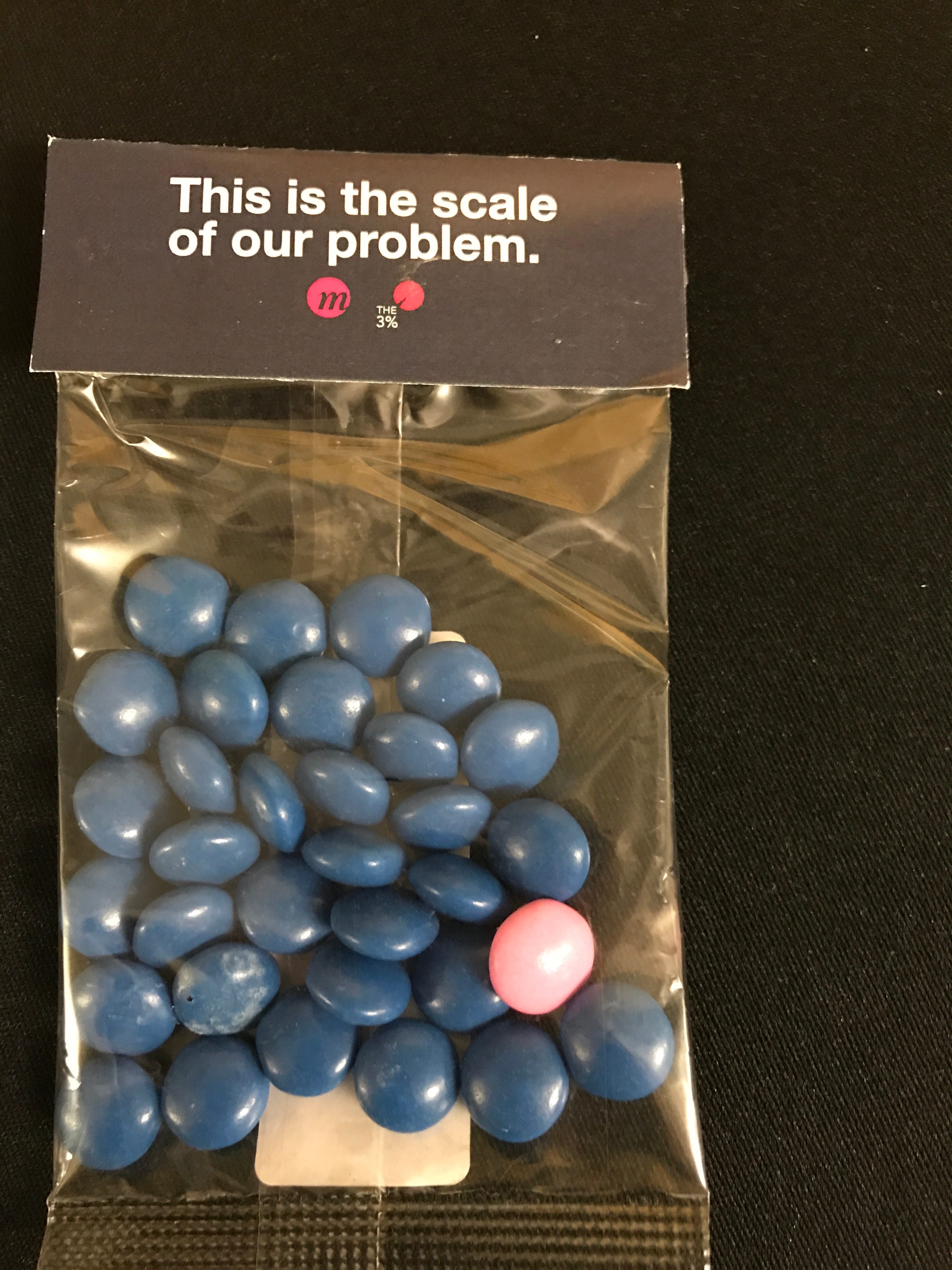
The following year we put dot stickers randomly on 3% of our conference’s printed programs. Then asked people who had a dot to stand up during opening remarks. It personalized a stat in a way that was hard to forget… and embarrassing to behold.
Fast forward to today. We’re in zettabyte territory — one billion times bigger than terabytes. Mind boggling. Everyone is in the data capture business. But no one seems to be in the data captivation business. Well, almost no one.
Here are a few of my favorite data viz creators:
1). Emilia Ruzicka: a 2025 graduate from UVA with a masters in Media, Culture and Technology, Emilia’s portfolio includes a year-long personal data project that inspired visualizations like this:
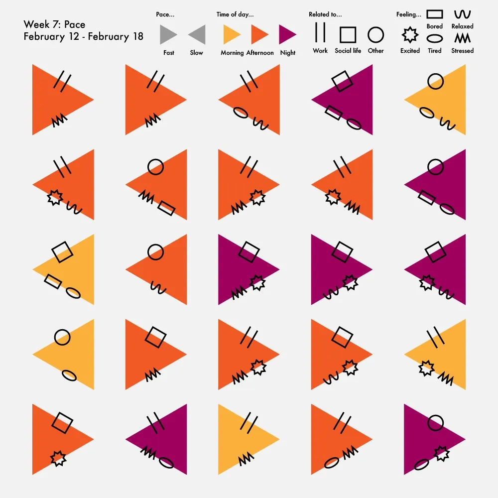
This may feel self-indulgent, but I sense something subversive at play here. A permission giving to others to be more tuned in to their bodies and energy during a particularly chaotic time in the world. Almost a morse code for moods.
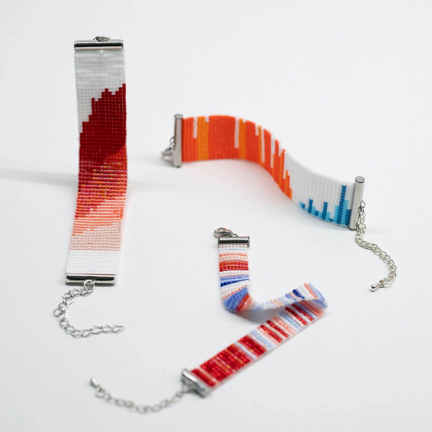
2). Eszter Katona and Mihály Minkó: This couple from Budapest created a grassroots initiative called Databeads. By bringing data visualization off the screen and into wearable, everyday objects, their easy-to-make bracelets start conversation around social and environmental issues. A simple “Love your bracelet!” compliment could launch an exchange that opens hearts and minds. More of this, pls.
3). Dan Goodspeed. Without doubt, the most mind-blowing data visualization I can recall came during Covid. A dynamic chart (think train station split-flap displays that shuffle and update) follows Covid outbreaks by state. As cases grow, an indisputable trend surfaces right before your eyes: states that vote primarily Republican are infected far more than those who vote blue. Disinformation kills.
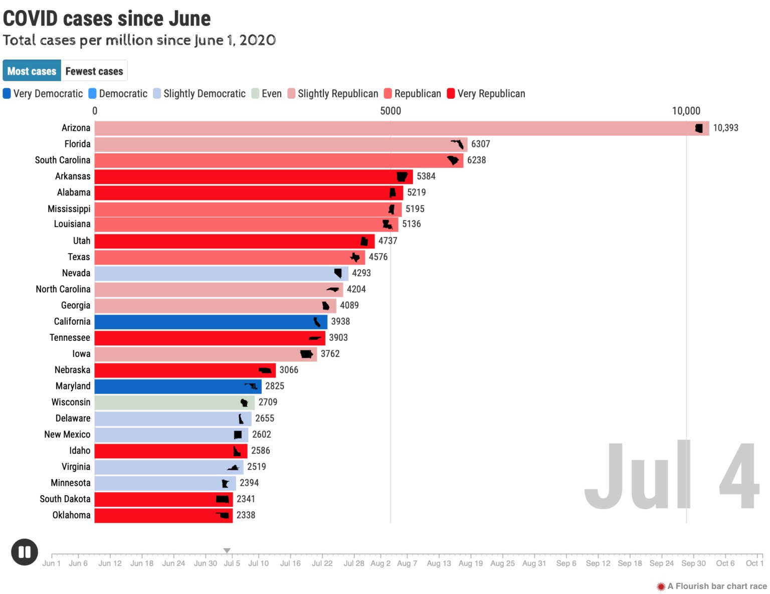
The image above doesn’t do Dan’s work justice. It is the dynamism of watching the cases shift and reorganize that is both dazzling and devastating. I’ll wait while you check it out.
How cool is it that someone who’s relied on words to get her message across — me — now fan girls so hard for this visual medium? The human brain processes visual information way faster than words. And we have so, so many complex issues to unpack as a society right now. We may not have time for words.
Until next time, remember that creativity knows no bounds.